How to build an insanely cool festival?
Client: Grape Agency
Grape Festival is “the festival” in Slovakia, having had over 150 thousand visitors over its ten-year history. We have been with the brand from the beginning and through the hardest times, when it was an unknown event and when the brand recognition was low. Grape has now sold out for eight consecutive years (except for a pause due to COVID) and it is redefining every year what a contemporary audio-visual celebration should look like.


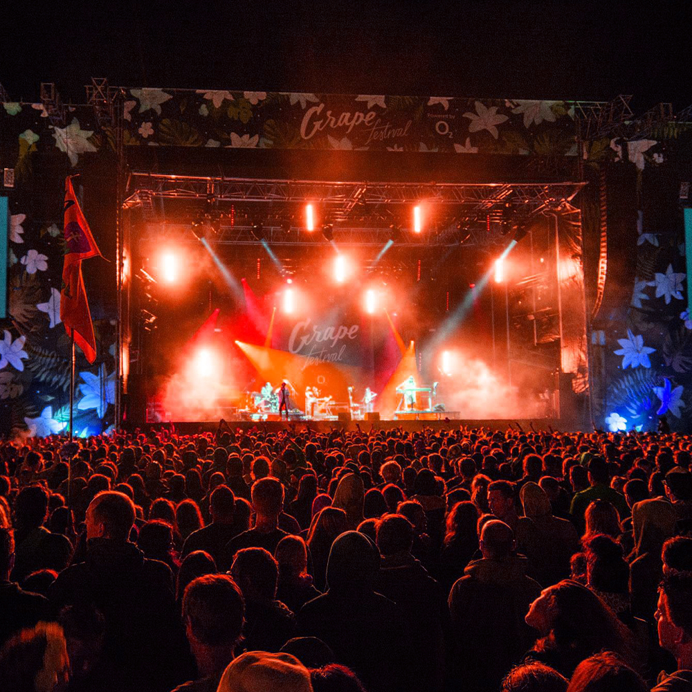
We experimented and discovered a revolutionary approach in restarting the brand communication every year with a completely different theme and identity. This was a risk because it could confuse the audience, but in fact the opposite happened. People were quickly hooked on the changing themes and wondered what the following year would look like. The theme reflected every year’s trends in design, fashion, and music; the brand was always up to date and gained new age categories of young fans. For brands like music festivals, accurate communication is critical. Their customers are experiencing the venue intensively for three days in the summer but are also interacting with the brand over the whole year. We will look at the three most important years for the brand’s success — 2014, 2015, and 2016.


2014 — Romantic Florals
In 2014, the theme was romantic flowers – one of the most popular themes in general. The use of flowers proved to be an absolute jackpot. It was great that, in addition to the brand’s audience, our mothers and completely different groups of people liked the flowers and the festival mood.
It was also a turning point in what summer festivals should look like in general. Until then, it was still about the importance of being brightly coloured, cheerful, summery, and crazy. Here we used a dark background that worked incredibly well and really made the floral design stand out. We added the white dots to let them evoke the feeling that you are lying on the grass and you can see the stars among the flowers. Let it support that romantic emotion.
We don't even have to mention any certain inspiration. There are a lot of these things all over the world, but we tried to give it our own flavour, style, and signature. We made all the inscriptions and the logo by hand (as in previous years), but this time it was more calligraphic and classy. The connection with the premises and dress code was also great. The floral shirts and clothes were amazing, but the most beautiful things were – of course – the real flowers worn in women’s hair.


2015 — Melting Rainbows
For the 2015 edition, the inspiration was all those coloured spots and melting and overlapping colours. Multi-coloured stones, foil, bubbles, and simply everything that refracts light into a rainbow was used to create fascinating coloured structures. For the first time, there weren't any hand-drawn visuals; instead, we used other techniques. We wanted as many outputs as possible to be directly from some holographic or similar material.
For some things (e.g. posters and banners) this was not possible due to readability or price. Therefore, we had to solve things in a different way. We physically made moulds for the letters , which we filled with water and holographic paper and then left to freeze. Then we photographed the melting process. The great thing was that for the first time there was a story behind it that could be documented — and that it was not only digital but really tangible. Similar materials and colours also appeared in the dress code; we also added silver and gold just to make everything shiny.


2016 — Clean, Decent & Minimalistic
2016's topic arose quite quickly. We always liked the colour white and simple posters – but we were a little afraid of it. But now we realized that it was the right time to try it. We also wanted to do something really radical that year; this could be seen on the tickets, which are actually nothing. It’s design by no design — radical and viral.
We wanted it to continue like that — create a festival without any actual visuals —and for everything to be completely white. In the end, however, we changed that and used the motif of classical sculptures, which are mostly white. We made them using a modern digital method in collaboration with 3Ds VFX artists David Šandrik and Jakub Goda. We scanned real festival visitors into a comprehensive 3D model, and then we continued to work with them until a digital relief was created.


CREDITS:
STRATEGY, ART DIRECTION & DESIGN: PAVOL BARTOŠ
DESIGN: MARTIN KLEMENTIS
MERCHANDISE PRODUCTION: MICHAL DARILA
ARCHITECTURE: MARTIN SKOČEK, ANDREJ OLAH
PHOTO & VIDEO PRODUCTION: JAKUB MARKECH, MATÚŠ BENCE
3D VFX: DÁVID ŠANDRIK
CODE: TRIAD AGENCY
PRINTIG: DIW, S.R.O.
Selected Works

RukaHoreProject type
Bratiska B2BProject type
NeovizeProject type
AtomStudioProject type

MartDentProject type
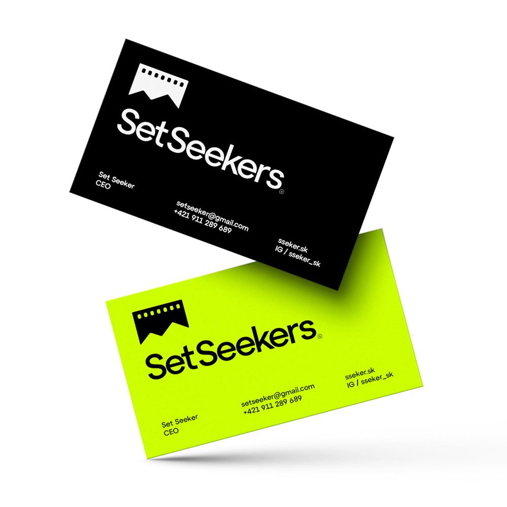
SetSeekersProject type
Wood Real EstateProject type
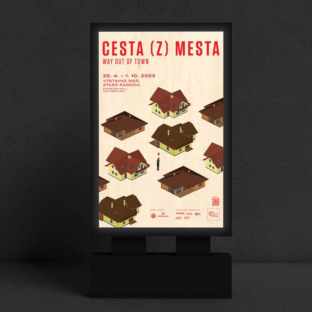
Way out of townProject type
Art-direction and consultingProject type

Fuud.skProject type
Greatest SlovakProject type
Interpreters.skProject type
Merch.skProject type
Welz Eco LandProject type
Fit&CoProject type
RousProject type
Creating better tomorowProject type

Basketball Shooting ClubProject type

Café ReginaProject type
KubistaProject type
Slang BookProject type
Office:
Dunajská 4
81108 Bratislava
Slovakia
Billing:
Bratiska, s.r.o.
Klemensova 17
81109 Bratislava
Slovakia
VAT: SK2120035544
REG: 48077844
© BLESS STUDIO 2011 — 2025, VISUAL ARTWORKS AND ALL COMPONENTS ARE INTELECTUAL PROPERTY OF PAVOL BARTOŠ, BLESS STUDIO, BRATISKA, S.R.O. AND / OR RESPECTIVE OWNERS